tiket.com
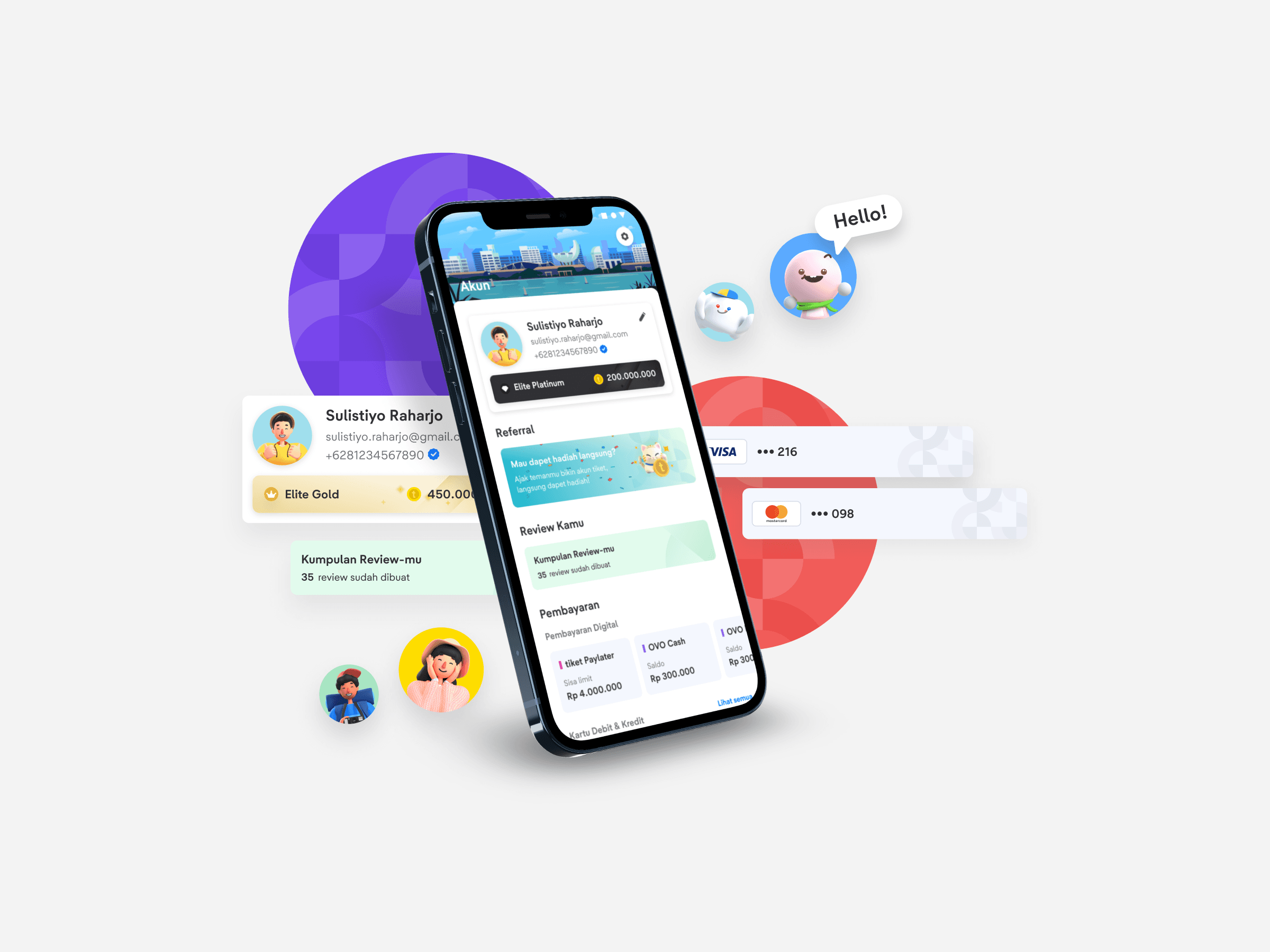
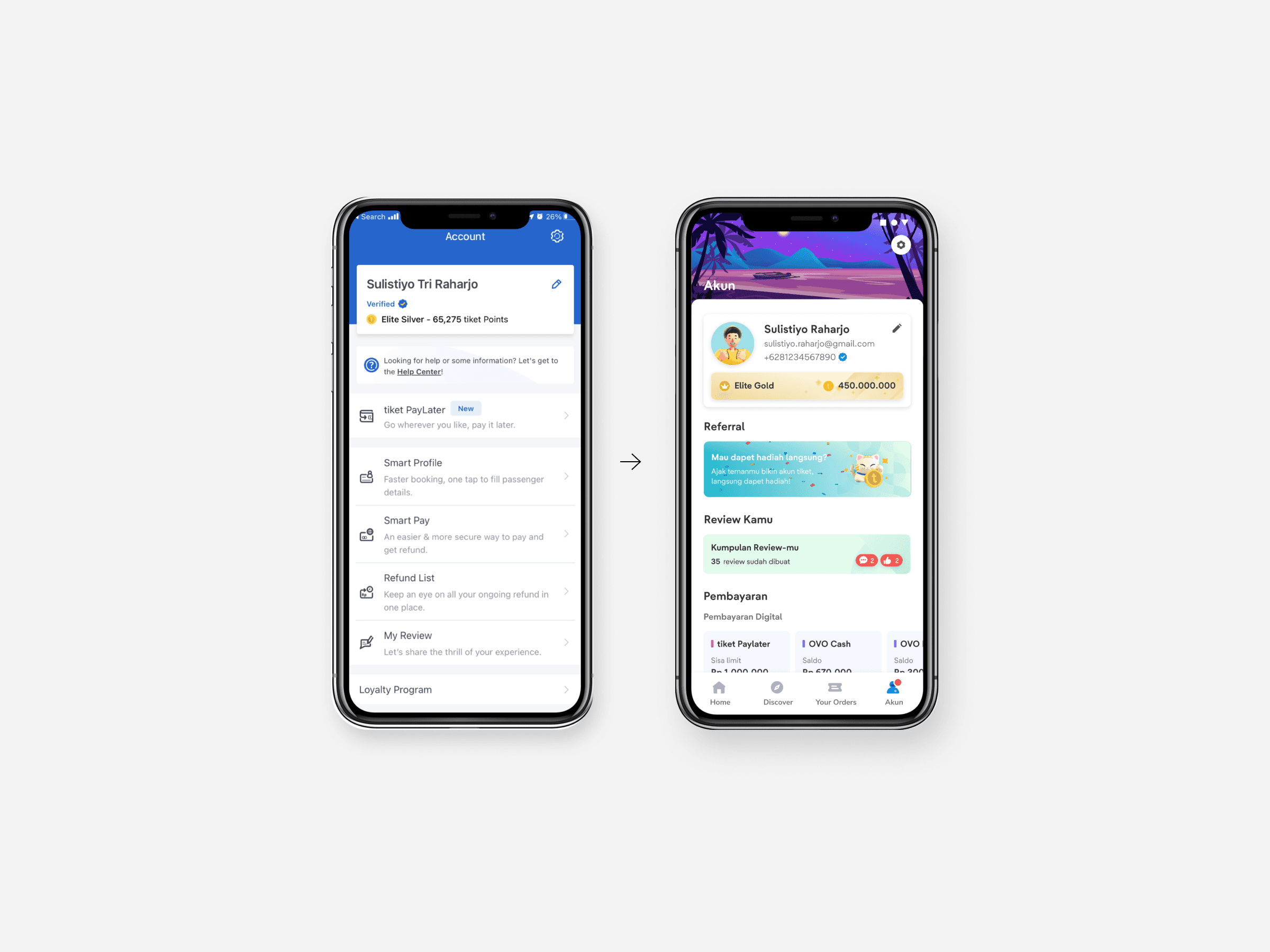
A fresh take on the account page
May-July 2021
Understanding the background
tiket.com is an Online Travel Agent from Indonesia. It is the go-to online market place for product and services that covers flight, hotel, car rental, event and attractions, train, and airport transfer bookings. Currently we already have an account page where user can manage all their personal data there. But, there are several problems that we want to solve.
Return as it should be
Our researcher spoke with users and discovered that the current account page was difficult to navigate since features were shown without context. There isn't enough proximity, contrast, or personalisation. Users are likewise concerned about the security of their accounts, yet the majority of them do not take advantage of our security features.
The intentions of this redesign are to make it easier for users to access and navigate through existing features, make user increase the security of their account, and also make them more invested in our app. Our big idea is to make the page as personal as possible for each user, like how it should be. We tested our new design to the people, and they like our new approach!
This project is not yet fully developed, but we hope that after its release we can increase the number of verified users, reduce account-related CS cases, and increase awareness of the loyalty program that we have.
Visually made fresher
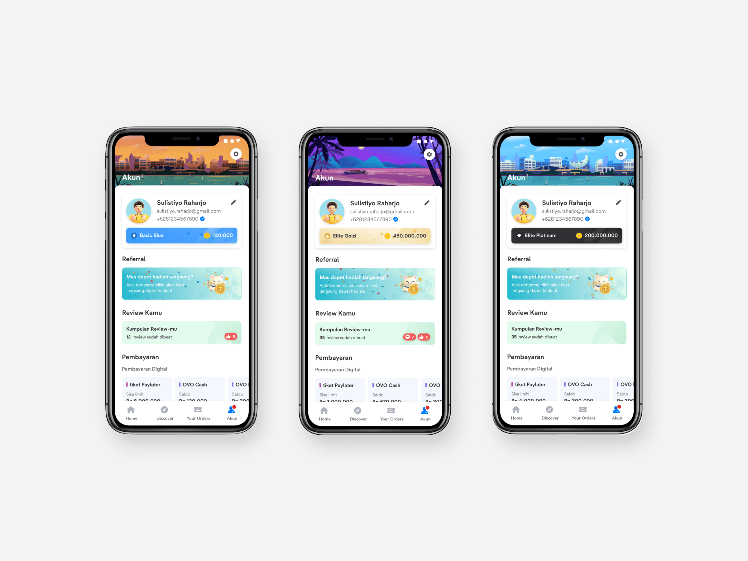
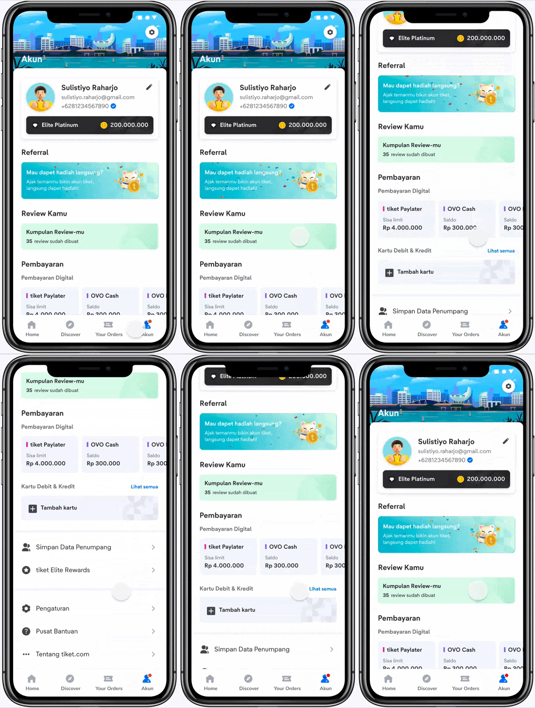
In the new design, it uses more vibrant color combination than the old one. Based on the UT, this makes the user's first impression more cheerful and warmly welcomed, making the new account page display more attractive.
Personalised. Only you have it
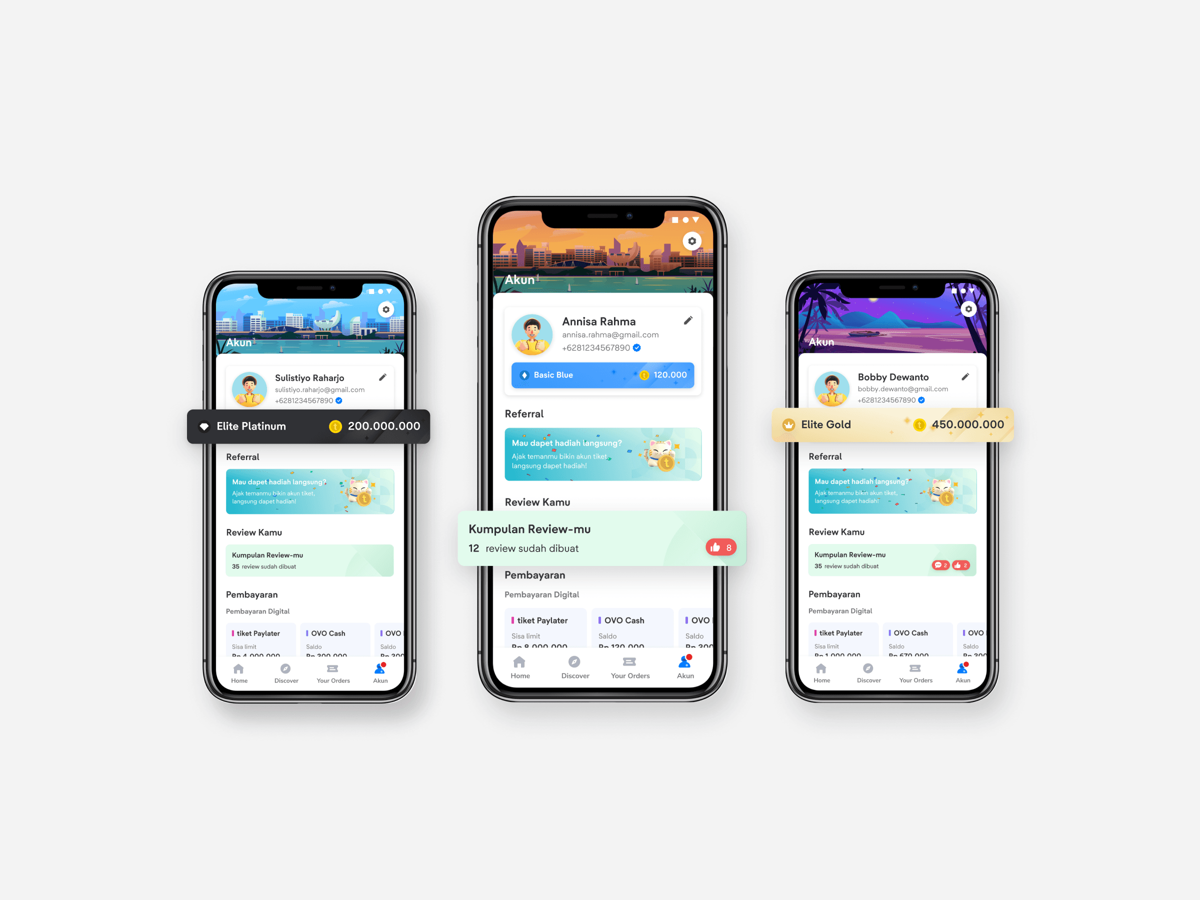
Most of the account page design and user’s data will appear different for each user, so it feels more personalised.
Improved navigation
We group similar features and made it closer to each other. Based on the test that we did, user can now navigate the account menu easier because of features renaming and group restructures.
Easier trip planning
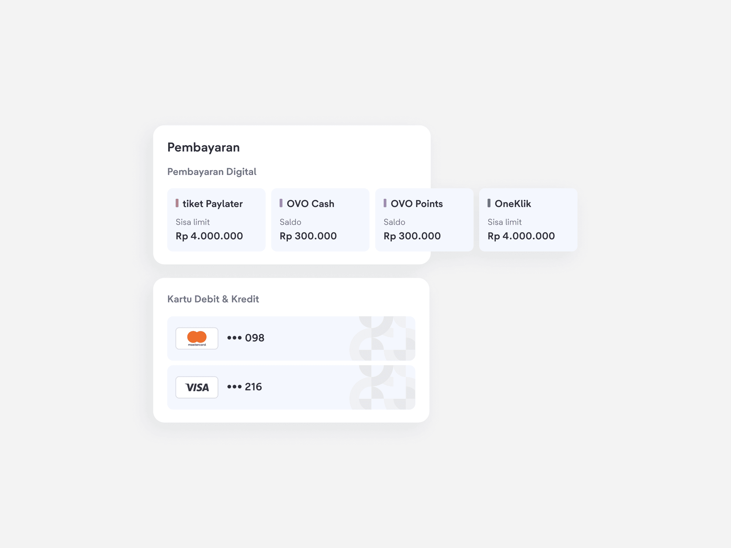
We show their paylater or e-wallet balance directly. This can make it easier for them to do budgeting during the trip planning phase. Based on the test, people found this very helpful and they love it.
Increased security
Encouraging user to utilise our security features with a real-time security check. It’s a one tap feature to know about their account security and how to increase it.
Small touch matters
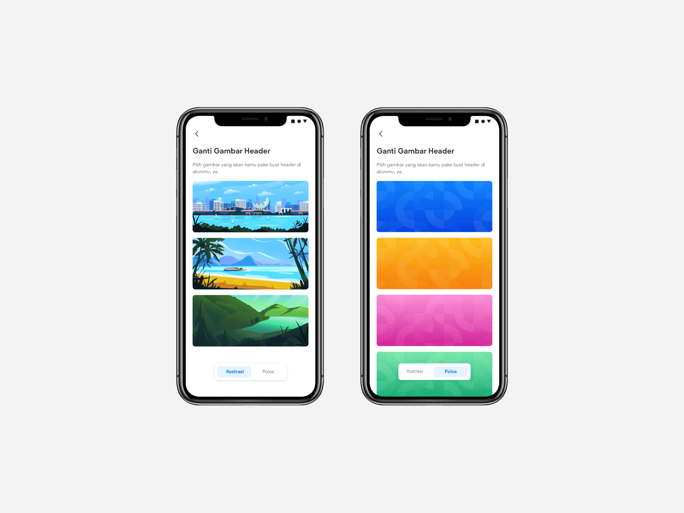
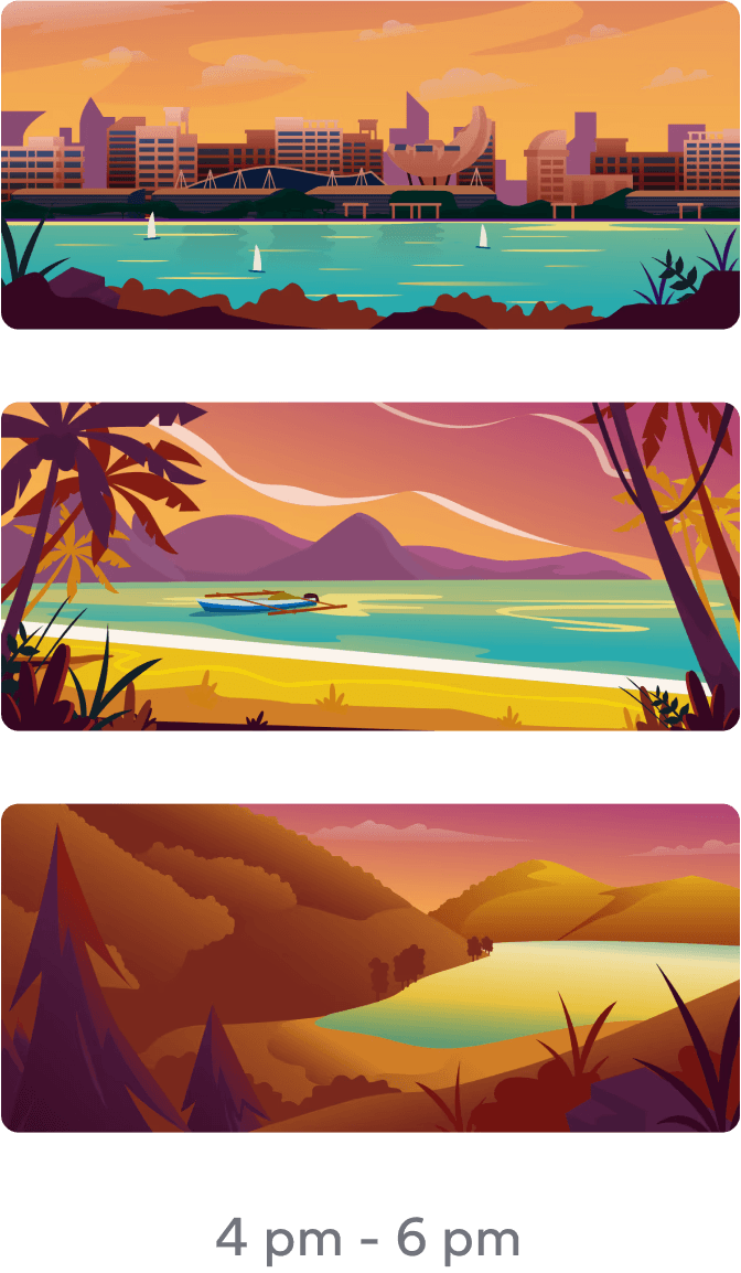
We provide several header image for user to personalize theirs according to their preference. This gives delightful experience whey they see it.
And, oh wait... It changes!
Boosted basics
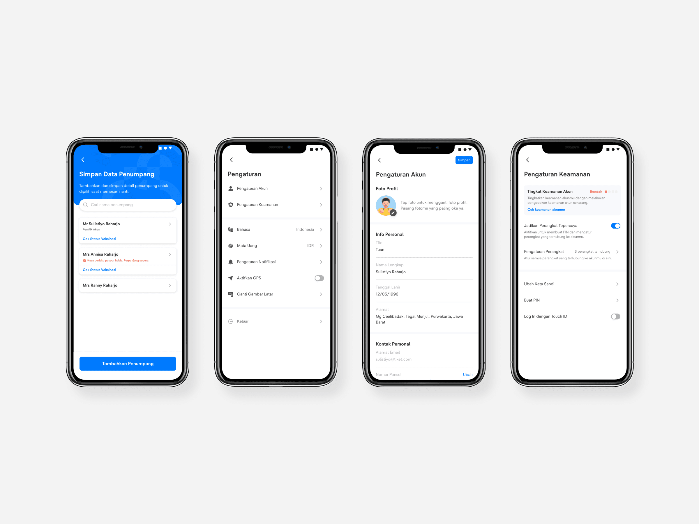
For the rest of the screens, it was all about nailing the basics. From adding passengers data, settings page, until security page, we improve the whole experience to make it clearer and easier to use.
The project is currently under gradual development and will likely be available on the tiket.com app in the next few months. I will provide an update on the results later here. Thank you for reading!
I know you only have a little time. So I intentionally made this case study as simple as possible. But should you care for more details, check the detailed version here ↗.
