tiket.com
Elevating membership experience
2020
Problem
tiket.com already has a loyalty program called TIX Point. However, the features of this program are still lacking and some of the functions are still unclear to customers. So that customers do not feel the benefits and meaningful differences by becoming a member at tiket.com.
Outcome
Enable user to invest more on tiket.com by making them feel exclusive, appreciated, and prioritized by the new membership system.
Output
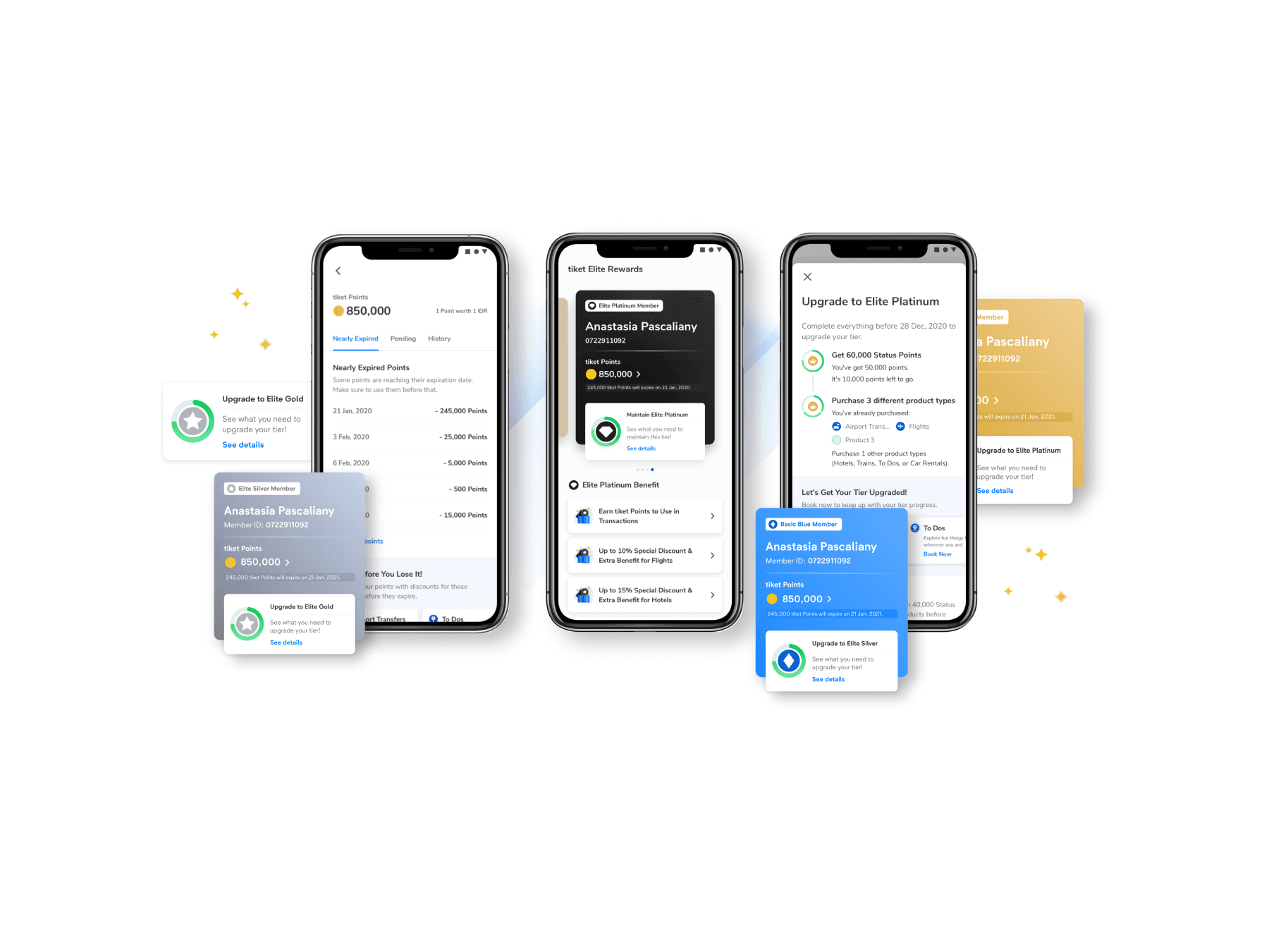
We do a major revamp on the user's membership page so that users can get clear information about the loyalty program. Adding some new features and functions on the page so users can truly experience the benefits and rewards that are obtained by becoming a tiket.com member.
Goal
We want to innovate and improve TIX Point so that it increase retention and reduce expense on promotion.
Starting point
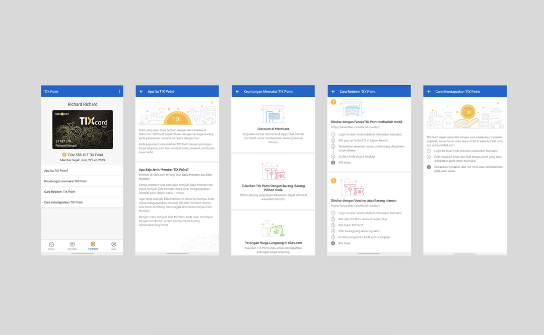
This is the design before we started the project. What I found when I visit the current app design were the page acts just like an informational page, lacks of experience, usability, and important information for users, difficult to digest the information because so many words to read. In addition, users can only redeem their points on the desktop platform.
User pain points
To understand more about this project, our researcher (Michael) conducted in-depth interviews and usability testing with a focus on general knowledge of loyalty program and usability of the current design.
From the interviews and usability testing that has been conducted, we have found a number of user pain points which we have categorised into 3 problem categories, namely Discoverability & Accessibility, Points, Benefits and Leveling.
Discoverability
TIX Point page for app and website don’t emphasise on the rewards, but more to information only.
tiket's loyalty program other than direct price cut can only be accessed from desktop.
Lack of touch points on the application so that users are not too aware of the existence of the loyalty program.
Points
No reminder for expiring points.
Don't know where to find the info on how to get points.
Don't know about the conversion of TI Point to Rupiah and vice versa.
Benefits & leveling
There are 2 tiers, but no difference of being a basic user and elite user.
No clear info about how much TIX Point left to reach the next level.
Most of users don't know what level they are currently at.
Most of users don’t know what the point can be exchanged for.
The rewards are not exciting enough for our users.
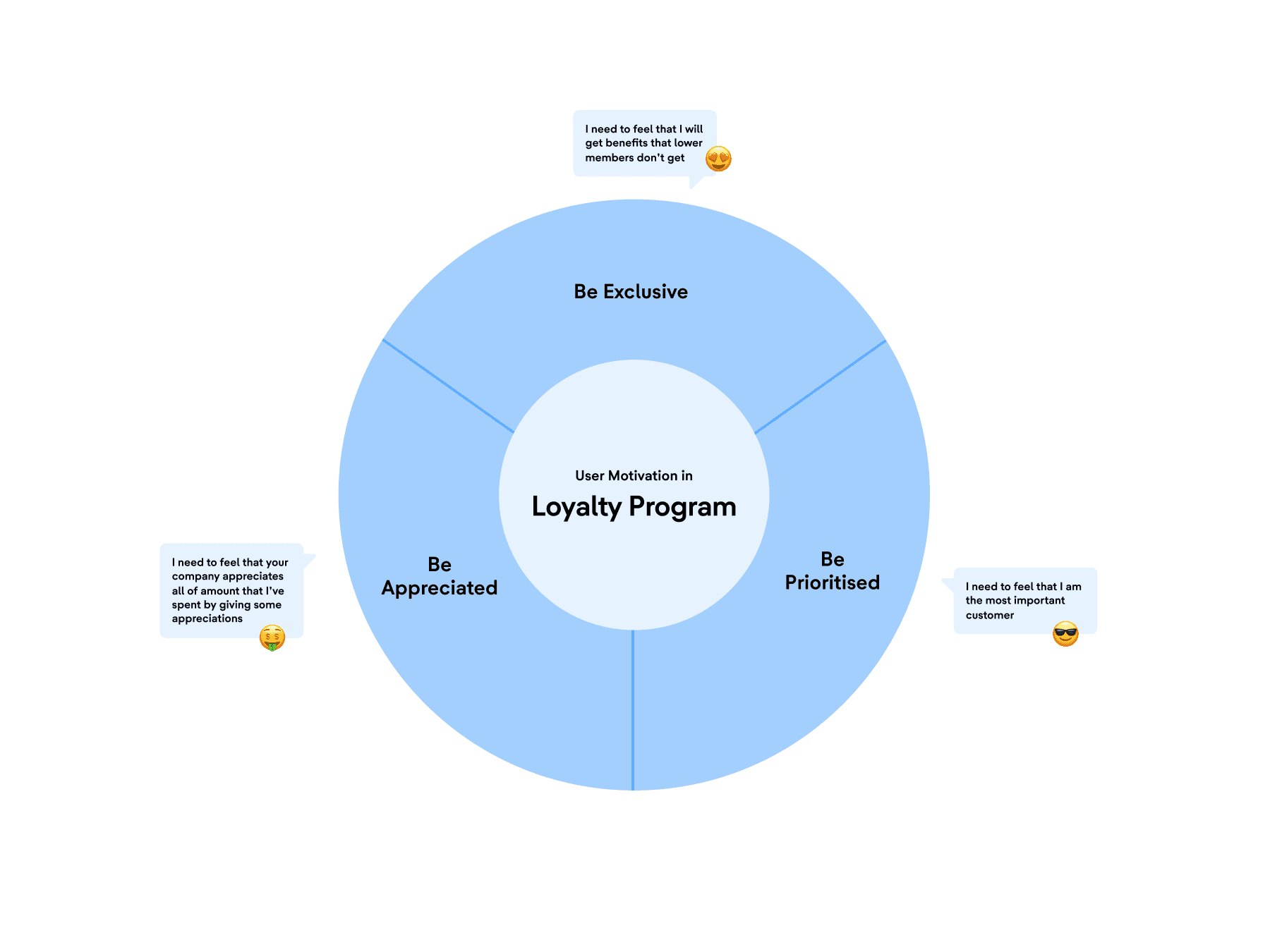
User motivations in loyalty program
From the interviews conducted, we got several user motivations that drive users in a loyalty program. This is one of our bases in designing the new loyalty program.
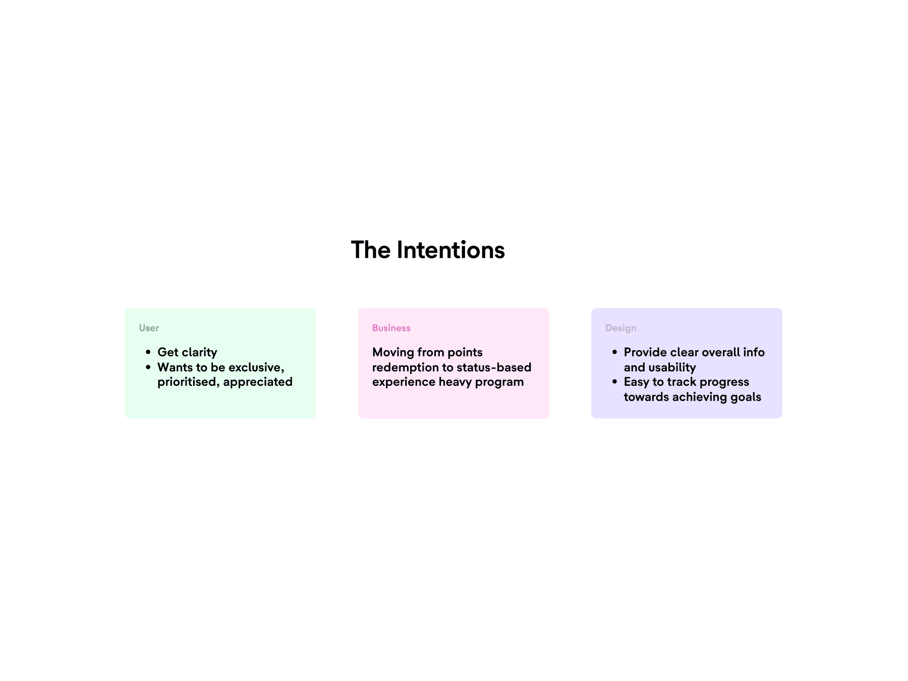
Gathering intentions
We also collect intentions from business and product stakeholders so that we can align with the company's vision, while we get the user's intention by analysing research data.
Design opportunity
From the research, data collection and intentions carried out, we identify opportunities that can be done in our design using the HMW framework:
Inform clear information regarding tiket’s loyalty program?
Make the users able to use loyalty program from whichever platform they use?
Remind users that their points is about to expire?
Make users feel more exclusive, prioritised, and appreciated?
Make it easier for users to find their earned benefits and rewards?
Synthesis: Journey mapping
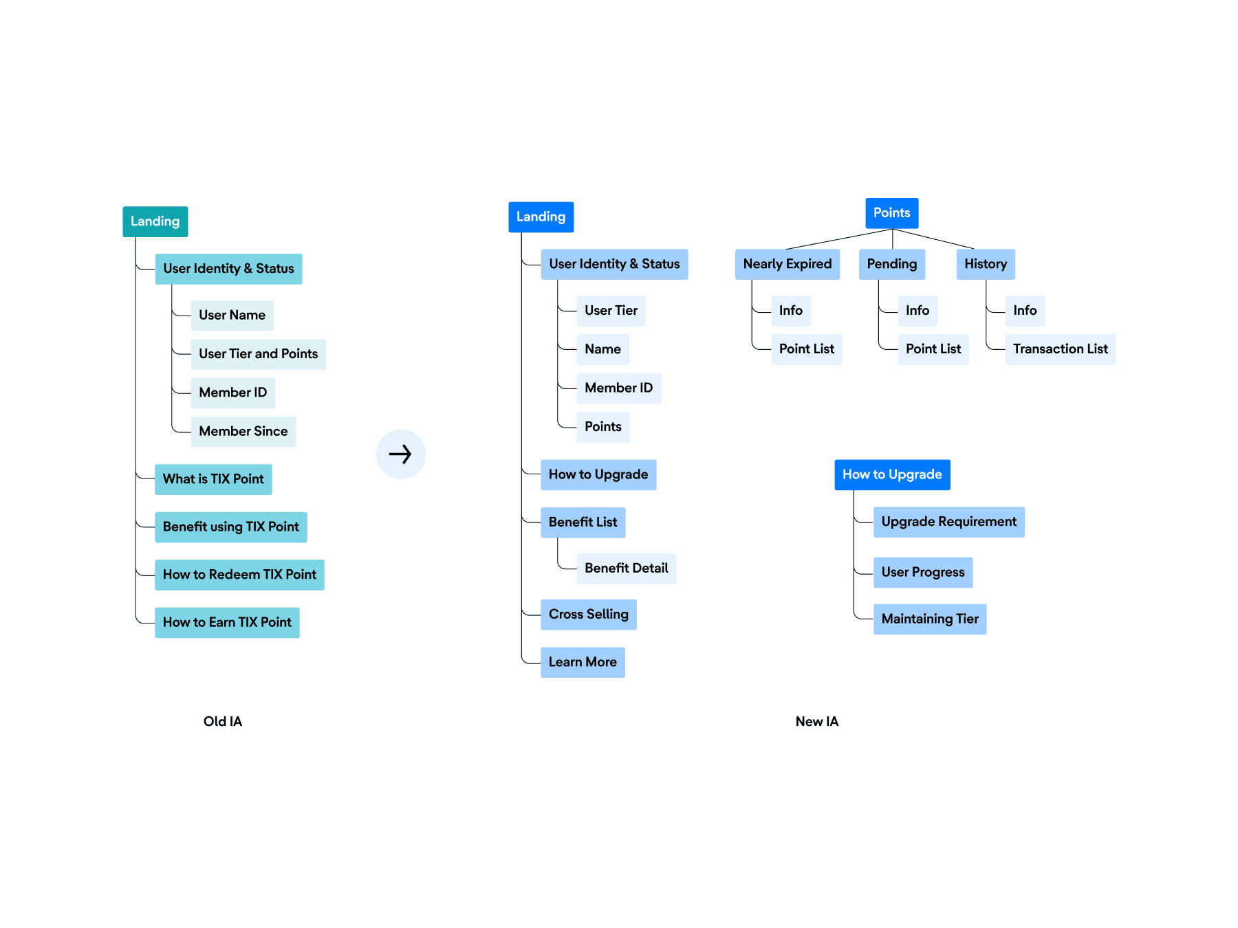
Based on data from user interviews, we organise our observations and categorise them through a customer journey map. This helps me to locate the user's pain points, in which areas can be improved along the user's journey using the app, and to make the new information architecture.
Designing the experience
I refined the design with research outcomes in-line with our business goals and went through a few rounds of iteration. After a couples of meetings, we also came up with a revised information architecture that focused on user status, points, benefits, and upgrading tier.
Generating ideas
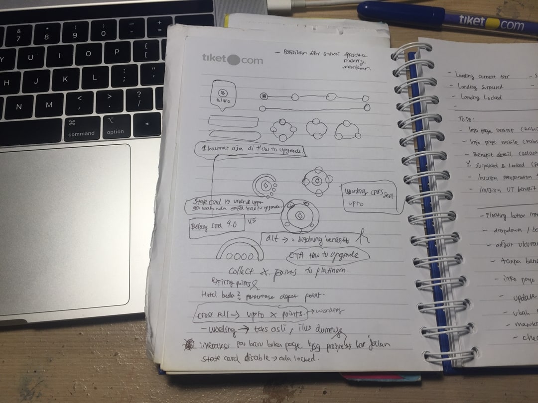
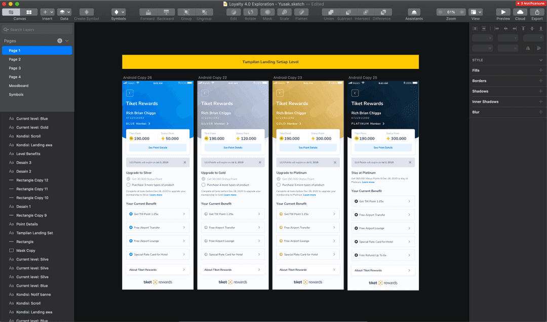
I sketched countless ideas and brainstormed various possibilities with the loyalty product team and then finally did some high-fidelity iterations. After some meetings with the design leaders, stakeholders (PM, Corporate Strategist), and the Board of Directors, we finally came up with the final design solution for this first phase.
Output
1. From TIX Point to tiket Elite Rewards
Previously, our loyalty program was called TIX Point. However, this has caused confusion among some of our users, because there is a loyalty program with a similar name from another company in Indonesia (LoyalTix by TIX ID). Therefore, with the launch of our new loyalty program design, we are also changing the identity of our loyalty program, from name to logo. We name it tiket Elite Rewards. We changed the word TIX to tiket to reflect our company name, Elite is taken from the name of one of our tiers that our users already know, and Rewards to represent this program that is rewarding to our users.
2. Balancing user needs with business goals: Increasing tiered benefits
We made the levelling system from 2 levels to 4 levels. This aligns with the intention of the business team and users, where the business team wants the loyalty program to become a status based experience, and users want to feel exclusive, prioritised, and appreciated. Levelling system also makes users to be more competitive and have the urge to level up as they want to taste the better benefits.
We also discontinue TIX Shop (where users can redeem points to exchange physical goods). Based on the results of research conducted, it was found that users actually prefer core products and vouchers to merchandise. This is also in line with business intention to focus more on status-based experience heavy program.
3. Make it easier and clearer for user to find out their status and benefits
Many users have difficulty getting clear information about what level they are at, what benefits they can get, how many points they have earned and have to collect to level up, and other pain points that I've mentioned above.
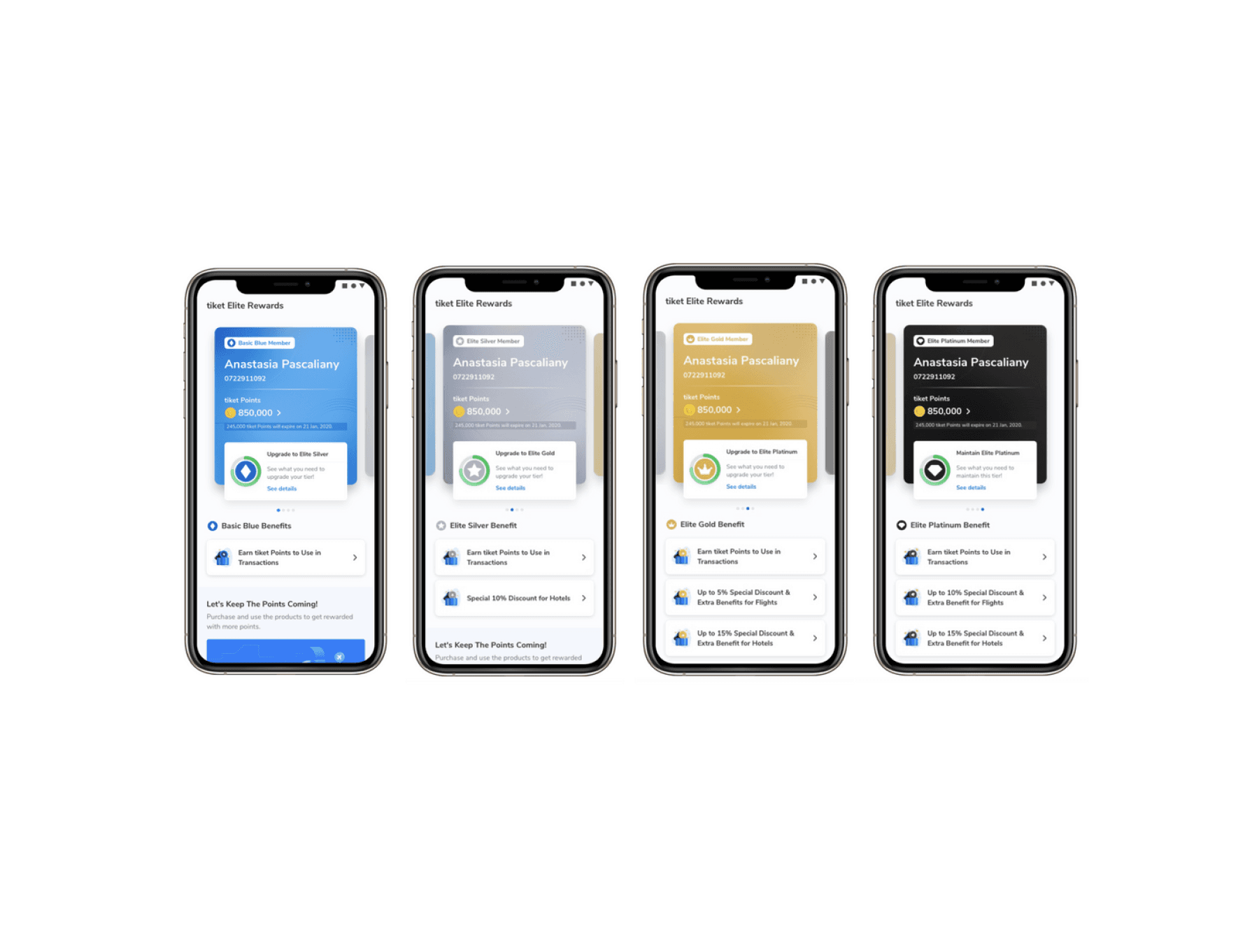
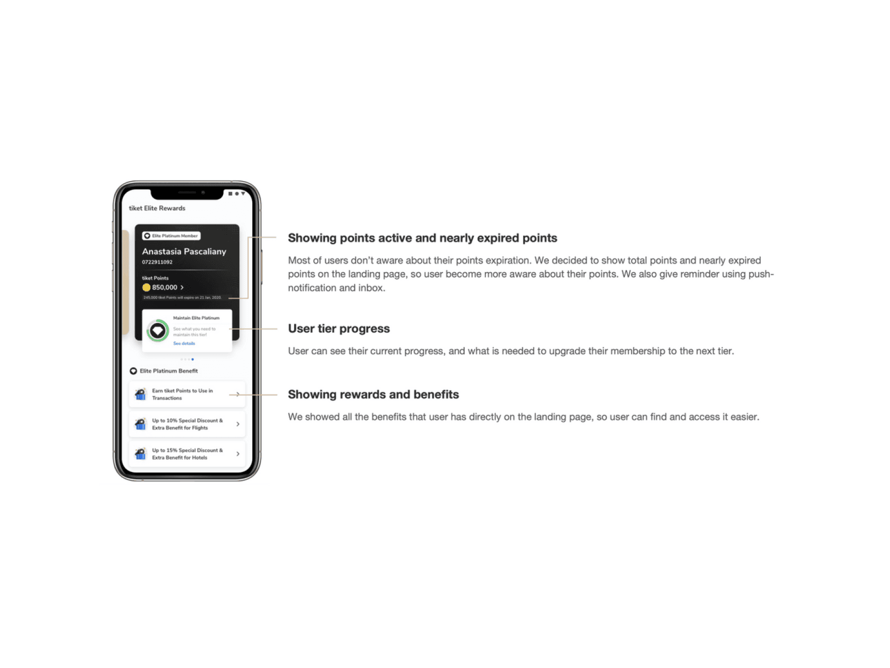
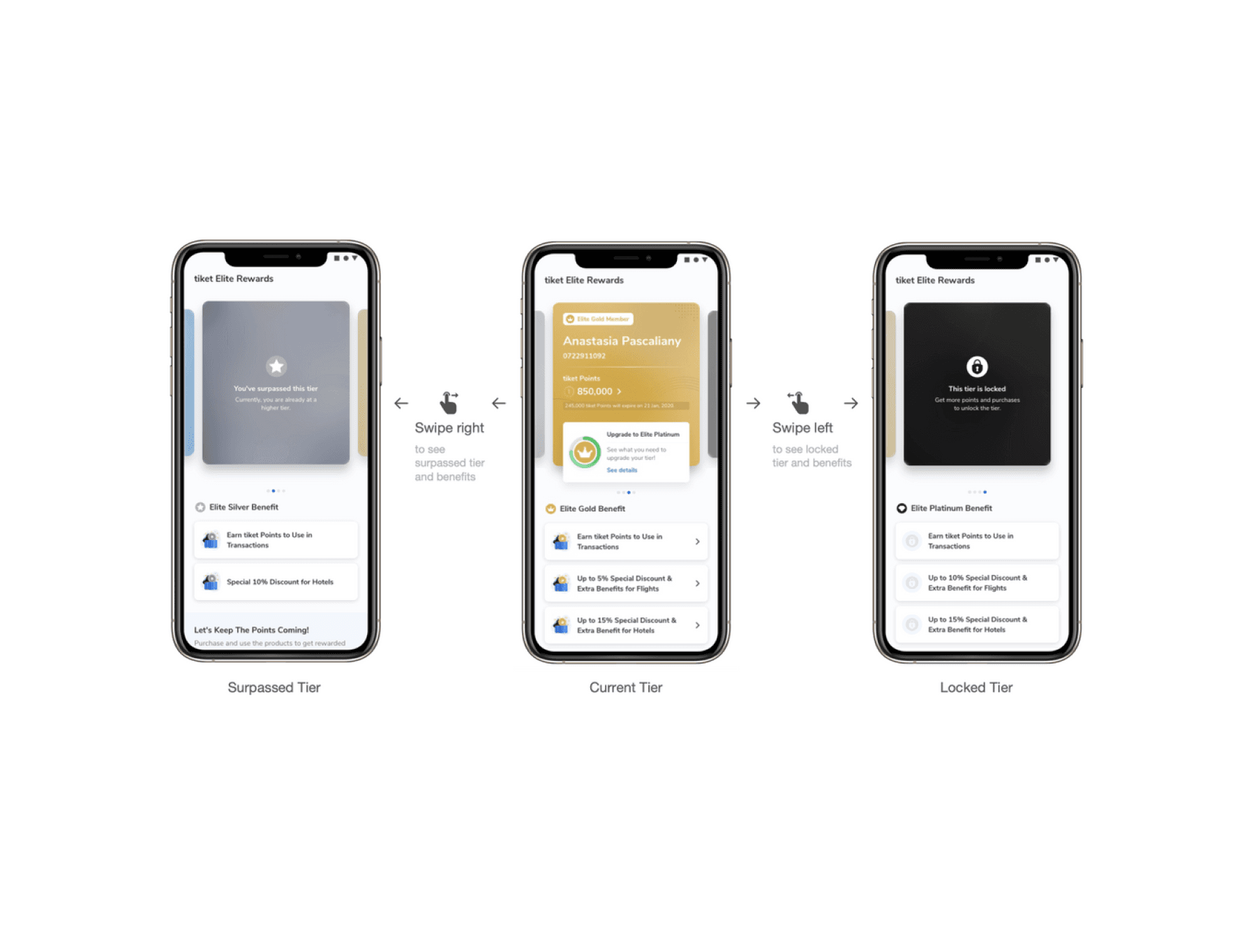
So, I redesigned tiket Elite Rewards landing page with the main focus on letting users know their status, points, and benefits. In this design, each user will feel the difference between tiers through the different color of the tier card at each level. Every user's tier is also placed first and is represented by an icon and color. Users can also see the total tiket Points that are owned and which will expire more clearly. Users can also see their progress to move to the next tier, and the most important, to see their benefits.
After some iterations, finally I made the interaction of this page to be swipeable, to make it easier for users to see and compare the benefits from one tier to another. This is also shown from the CTR results which reached 42.74% after a month of release.
4. Tracking, upgrading, and maintaining tier
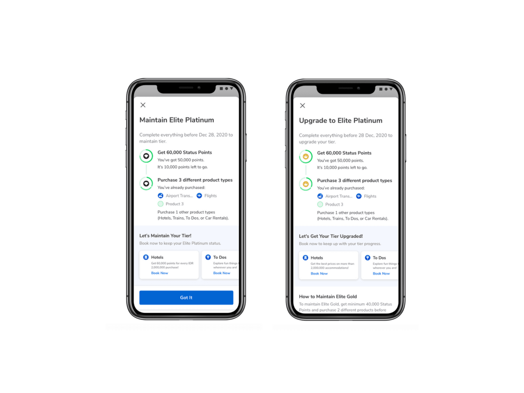
Users can see all the details related to their status in this bottom sheet. They can see their tier progress and the requirements to move up to the next tier, as well as how to maintain their tier by tapping on the See Details button on the previous landing page.
5. No more worry and confusion about points
Users can get tiket Points by making transactions at tiket.com. The points earned by the user can be collected to be exchanged for a discount on the next transaction. This is an investment for the user, and we don't want to make users afraid to invest in our loyalty program. In the past, users could not clearly know the information about the points they have, when they can get points, and when the points will be expired because there is no reminder.
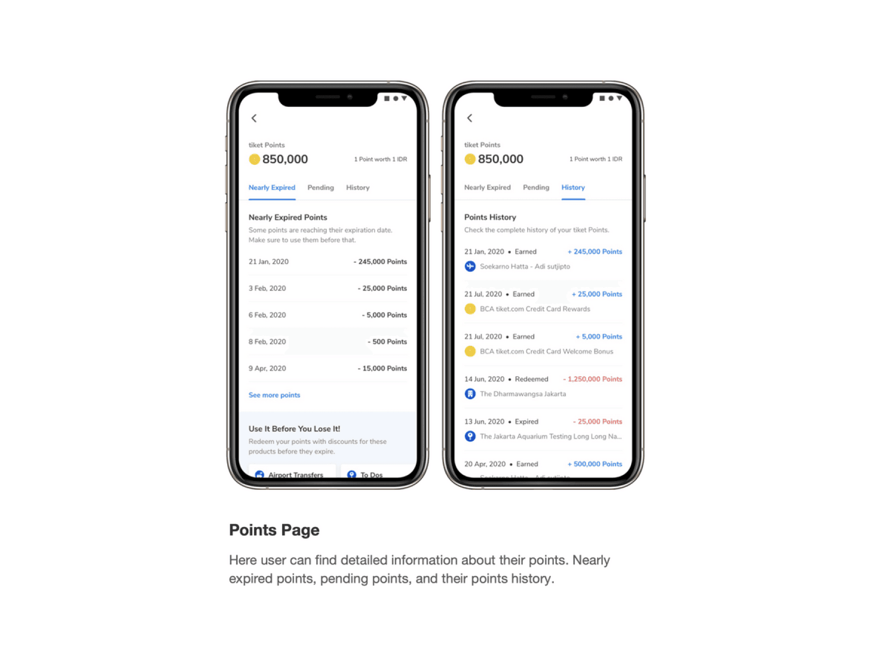
Now, on the Point Detail page, users can see their active points, conversion of tiket Points values to IDR, points that will expire, points that will be active, and their point transaction history. We also provide notifications via push notifications to remind them when a point will expire in the near future.
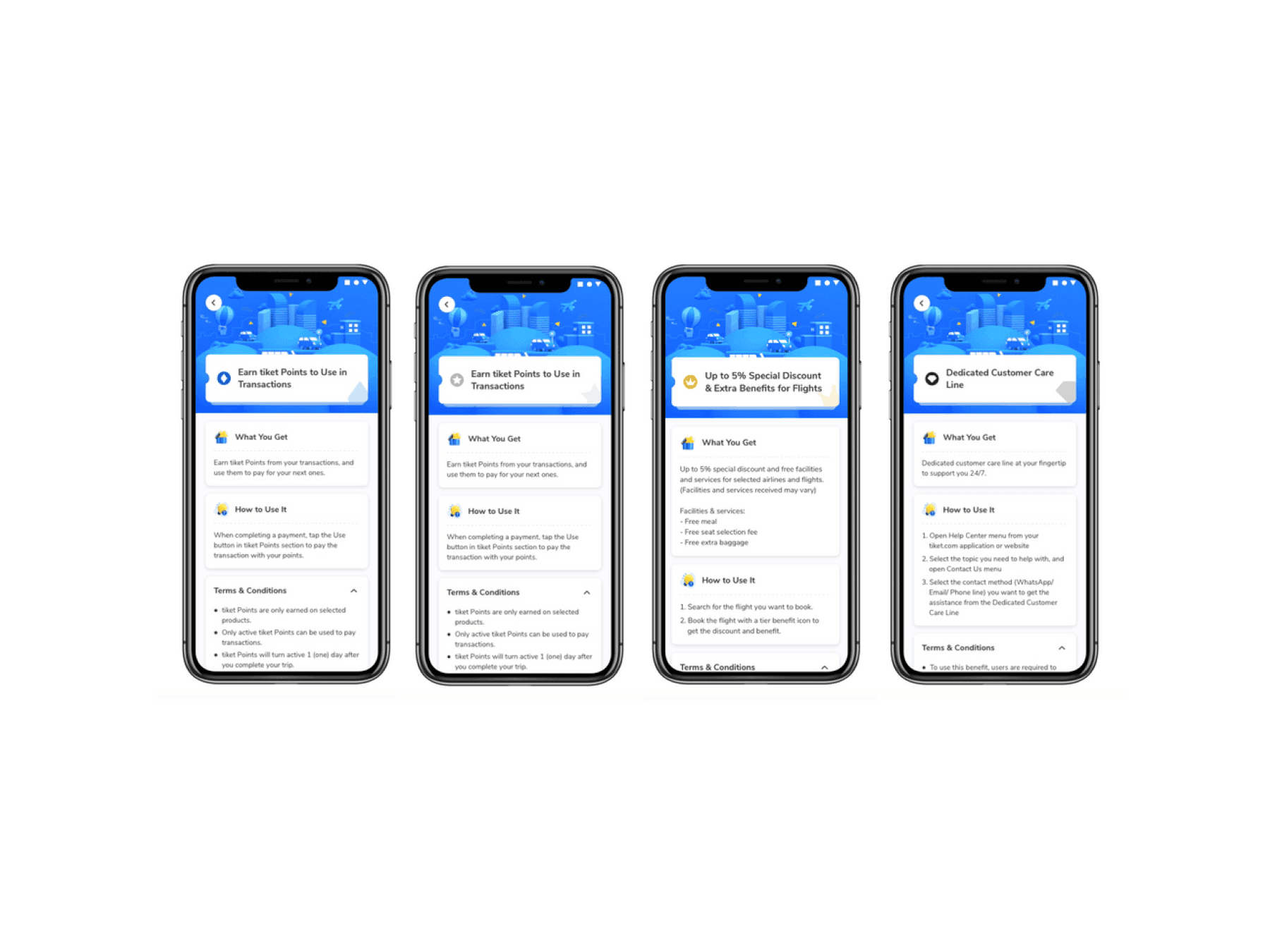
6. Benefits & rewards
In this new loyalty program we want to give our users benefit that are more valuable to them. Based on the research, users prefer core products than physical product redemption. So we give what our users want. The rewards that they can get are like discounts, early access to promotion, and also we give dedicated customer care for them. This rewards varies based on their tier. They can see the details of the benefits on the benefit detail page.
Results & takeaways
The previous design didn't have tracker that we can track to gather the statistical significance to validate the success of the new design. However, we're continuing to get feedback from users and iterate on the designs to improve the user experience.
So far, we've noticed positive changes and feedback in the following:
- 85% Hotel benefit engagement since 3 months after released
- Decrease in CS tickets related to points and tiers
- Our Elite user movement is gradually increase.
Learnings
Since this is my first time handling big revamp project, I learned so much about collaborating personally with PM, researchers, writers, illustrators, business team, and developers.
Related to core products that we give as benefits for user, we have to collaborate with the related verticals. That's a bit challenging for us because we have more than 5 products to be aligned with, and every vertical has their own needs and goals. But, at the end of the day we're managed to meet everyone's goals.
There are still many opportunity that we can cover in terms of customer loyalty and we're always learning to make better improvement in the future.
And that's just the beginning
After this project, we continued iterating and improving the page to make it even better. We accomplished (and learned) a lot in the experiments and iterations following this launch. I will update it when the study case has been finished.
